Hello
Thank you for exploring my portfolio in such detail! This case study represents my very first full UX project, a personal milestone that I’ve tucked away as a bonus for those who dig deeper. It captures my early journey into user-centered design, complete with all the learning experiences, challenges, and iterations that shaped my approach. I appreciate your interest in revisiting my foundational work and look forward to growing and evolving as a designer with each new project.


Competitive Analysis
After searching online, I found that few tools cater specifically to a young user base navigating major life transitions like moving for college or a career. “Best Places” charges a hefty fee and is geared toward retirees, while other platforms lack features like comparison tools or focus on smaller cities less appealing to young professionals. “Niche” comes closer but focuses solely on helping students find schools, leaving gaps in housing and community resources.
This highlighted an opening for a platform like Move Mentor that offers a comprehensive, user-centered approach to relocation. By addressing affordability, accessibility, and key features, Move Mentor fills a clear gap in the market while meeting the needs of its audience.
.jpg)
Story Boarding
Visualizing the user’s journey is a crucial step in UX design, helping to clarify design concepts and highlight key actions and emotional responses. For Move Mentor, I used this process to step into the shoes of users, understanding their challenges and emotions during the moving process. Since drawing isn’t my strong suit, I had some fun experimenting with AI-generated images to bring the storyboards to life. This creative approach helped refine navigation and interactions, ensuring the platform was intuitive, accessible, and closely aligned with real user needs. Ultimately, it set the tone for a user-centered design that empathizes with the stress and excitement of relocating.

User Personas
Understanding the goals, behaviors, and challenges of users is key to creating tailored and user-centered designs. For Move Mentor, I developed three profiles representing college students and young professionals, each with unique needs and motivations. These profiles guided decisions to simplify navigation, make information easy to access, and prioritize inclusive features. By empathizing with their challenges, like managing budgets and exploring unfamiliar cities, I ensured the platform supports a diverse audience effectively. This approach rooted every design choice in real user insights and expectations. Below are the personas and the color palettes explored during the design process.
 |  |  |
|---|
Affinity Mapping
Organizing user feedback into meaningful groups was a crucial step in understanding the needs and priorities of Move Mentor’s audience. This process revealed key themes, such as affordability, ease of navigation, and tools for comparing neighborhoods, while also highlighting smaller but impactful details like the value of streamlined budgeting features. Visualizing these insights made it easier to prioritize features and align the design with user expectations. This approach ensured that every decision was rooted in user perspectives, creating a platform that feels intuitive and responsive to their needs.
.png)
Goals
For the Move Mentor project, the goals were designed to address user needs while fulfilling the platform’s purpose. The primary objective was to help users secure housing that aligns with their budget and lifestyle, simplifying the often overwhelming relocation process. By focusing on reducing complexity and offering clear, actionable tools, Move Mentor would aim to empower users to make confident, informed decisions about housing, neighborhoods, and life in a new city.
Beyond housing, the platform prioritized supporting users in building a strong foundation in their new environment. This included helping users find neighborhoods that balance affordability with desired amenities and fostering opportunities for social and professional integration. The ultimate goal was to create a relocation experience that not only improved users' quality of life but also supported their career growth, offering a comprehensive and user-centered approach to moving.
.jpg)
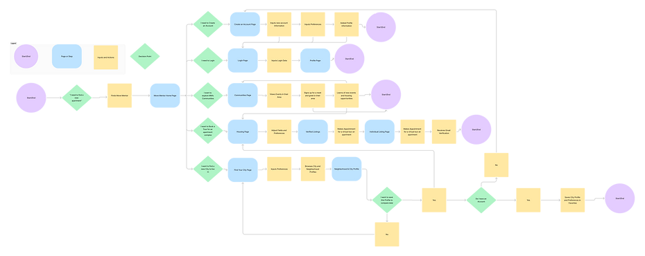
User Flows
Creating a clear path for users was initially a challenge during the Move Mentor project. Instead of jumping straight into a complete user flow, I broke the process into smaller, individual task flows, each focusing on specific actions like searching for housing or exploring neighborhoods. By combining these task flows, I was able to build a comprehensive user flow that effectively mapped the user journey.
This step-by-step approach helped me better identify areas of complexity and refine the platform’s interactions to feel seamless and intuitive. These mapped journeys guided decisions around navigation and layout, ensuring that users could easily achieve their goals, from securing budget-friendly housing to integrating into their new city. This iterative process reinforced the importance of building with both user needs and clarity in mind.
Wire Framing
The early stages of Move Mentor’s design process focused on establishing a clear and functional foundation for the platform. I began with low-fidelity (lo-fi) sketches to map out layouts, prioritizing structure and navigation over visual details. This approach allowed me to quickly test ideas and ensure the platform’s key features—like housing searches and stress-free navigation—were intuitive and aligned with user needs.
Building on these initial sketches, I transitioned to mid-fidelity (mid-fi) wireframes, adding detail to content placement and interactive elements. This phase provided a more realistic view of the platform while maintaining flexibility for iterative improvements. By focusing on usability at every stage, the final design stayed rooted in user goals and delivered a seamless experience.


Style Tile
The style tile for Move Mentor was key to defining the platform’s visual identity while aligning with user needs and project goals. The primary color palette featured vibrant blues, chosen to evoke trust and optimism, balanced with soft sky tones to create a sense of calm and approachability. Secondary accents included warm yellows for energy and vibrancy, paired with golden hues to add a touch of sophistication. Neutral tones like cool grays and soft whites provided stability and ensured a clean, professional aesthetic. Accessibility remained a priority, with all colors meeting AA compliance for inclusivity.
Typography was anchored by the Poppins font, a bold yet approachable typeface that captures the energy of relocation while ensuring readability across all devices. This cohesive visual language tied together the platform’s goals of reducing stress, simplifying choices, and empowering users to confidently navigate their moving experience.

Hi-Fi Prototyping and User Testing
Bringing the design to life through interactive prototypes allowed users to experience the platform in a realistic way, navigating its features and providing valuable feedback. These prototypes were instrumental in usability testing, help me uncover areas of confusion, validate key design decisions, and address usability issues early in the process. Observing users interact with the platform highlighted what worked well and where adjustments were needed.
Based on this feedback, I refined navigation, clarified button functionality, and improved the visual hierarchy to create a more intuitive and seamless experience. This iterative process ensured that every design decision was informed by real user insights, resulting in a platform that felt both user-friendly and empowering, aligning with the project’s mission of simplifying the moving process.

Final Design

The final product represents the result of thoughtful research, usability testing, and iterative refinement, bringing Move Mentor to life as a cohesive platform. Users can seamlessly find housing, explore new cities, and manage their moving budgets through an interface designed to be both visually appealing and highly accessible. Every element of the platform was crafted to align with user needs, ensuring a smooth and engaging experience.
By prioritizing user experience, the design simplifies the relocation process, making it intuitive and empowering for users. The final platform reduces complexity while addressing key challenges, allowing users to approach their move with confidence and ease.
Conclusion
Working on Move Mentor was an invaluable learning experience that deepened my understanding of user-centered design and the importance of empathy in problem-solving. Each phase of the project, from initial research to prototyping and usability testing, helped me refine my approach to creating intuitive, impactful solutions that balance user needs with business goals. The following key takeaways highlight my growth throughout the process:
-
Empathy-Driven Design: Conducting user interviews and incorporating feedback ensured the platform addressed real challenges and delivered a meaningful experience.
-
Iterative Refinement: Each iteration of the design, from wireframes to prototypes, brought the platform closer to a polished and seamless solution.
-
Visual and Functional Consistency: Establishing a cohesive style tile and clear user flows improved both the aesthetic and usability of the platform.
Move Mentor represents not just a final product, but a journey of growth in understanding how to create thoughtful, user-centered designs. The lessons learned from this project will continue to shape my approach as I take on future challenges in UX/UI design.
See what I've been up to
.png)
%20(1).png)
