
.png)
Project Overview
Pocket Wrench isn’t just an app, it’s a reimagining of what vehicle care should be. Say goodbye to waiting rooms with stale coffee and mysterious invoices. Designed for busy professionals and parents on the go, Pocket Wrench delivers on-demand scheduling, transparent pricing, and reliable mechanics right at your fingertips. It’s not just about fixing cars; it’s about fixing the process, making vehicle care effortless, efficient, and, dare we say, enjoyable.
The Design Process
Designing Pocket Wrench was a journey in problem-solving, fueled by the frustrations of real users who needed more than a mechanic, they needed a solution. Research uncovered the usual suspects: scheduling headaches, unclear pricing, and the constant hunt for someone trustworthy. From there, it was about turning complaints into a blueprint for change.
-
User Flows: Every click, every tap was mapped out with purpose, creating seamless pathways for booking, managing profiles, and tracking progress.
-
Wireframes: Armed with a dot grid notebook and inspiration from Chicago’s bold architecture, I sketched layouts that were as functional as they were structured. These rough ideas laid the foundation for polished high-fidelity designs.
-
Feedback-Driven Refinement: Users became co-creators, pushing features like collapsible service categories, progress tracking, and mobile-responsive layouts into focus.
-
Visual Identity: Pocket Wrench wears its colors with pride, purple, white, and yellow, a playful yet professional palette that’s both inviting and easy to navigate, anchored by the versatile Roboto font.
Pocket Wrench isn’t just another app; it’s a carefully crafted tool for taking the stress out of vehicle care. It’s where functionality meets flair, transforming a dreaded chore into a seamless experience you can trust.
User Personas
-
Key Personas: Featured Lisa, a franchise owner, and Sarah, a supermom, representing Pocket Wrench’s core users.
-
Backed by Research: Personas were crafted using interviews, surveys, and industry insights.
-
Focused Approach: Prioritized these personas while shelving others, like fleet managers, for future phases.
-
Shaping the Design: These personas informed decisions around convenience, flexibility, and premium service.


Competitive Analysis
-
Insights: Organized user data into categories like Motivations, Challenges, Service Expectations, and Suggestions.
-
Key User Needs: Quick, transparent services; reliable communication; and flexible scheduling emerged as top priorities.
-
Pain Points: Users faced delays, hidden fees, and difficulty finding reliable mechanics.
-
Design Impact: Insights led to features like streamlined booking flows, transparent pricing, and real-time updates to address user needs.


Affinity Mapping
-
Insights: Organized user data into categories like Motivations, Challenges, Service Expectations, and Suggestions.
-
Key User Needs: Quick, transparent services; reliable communication; and flexible scheduling emerged as top priorities.
-
Pain Points: Users faced delays, hidden fees, and difficulty finding reliable mechanics.
-
Design Impact: Insights led to features like streamlined booking flows, transparent pricing, and real-time updates to address user needs.


Low-Fidelity
Wire Frames
-
Concept Development: Sketched initial designs in a dot grid notebook, prioritizing functionality.
-
Rapid Iteration: The tactile process of sketching enabled quick adjustments to layout and structure without focusing on aesthetics.
-
Architectural Inspiration: Influenced by Chicago’s clean, structured architecture.
-
Foundation for Prototypes: These wireframes established a strong framework paving the way for refined prototypes.


Site Map
-
Framework Development: Created the site map midway through the process to serve as a framework and checklist for building core features.
-
Core Tasks Mapped: Focused on organizing key areas like booking appointments, managing profiles, and tracking services to ensure all user needs were addressed.
-
Guided by Research: Insights from research and personas shaped the structure, ensuring logical pathways and minimal friction.
-
Foundation for Screens: The site map provided a clear structure, ensuring future wireframes and designs aligned with user goals.


Goals
-
Business Goals: Focused on growth by establishing a recurring client base, launching an intuitive platform, and forming local partnerships.
-
User Goals: Prioritized convenience, reliability, and transparency, driving features like real-time updates, flexible scheduling, and clear pricing.
-
Common Goals: Emphasized trust and long-term relationships with seamless booking flows, consistent communication, and services.
-
Strategic Impact: These goals provided a roadmap for development, balancing user pain points with sustainable growth for a premium, on-demand experience.


User Flows
-
Building on the Site Map: Expanded the site map into actionable pathways for key tasks like booking, profile management, and progress tracking.
-
Creating Seamless Paths: Combined individual task flows into logical, intuitive paths that guided users step-by-step.
-
User Insights in Focus:Addressed pain points like scheduling friction and unclear navigation, using research and personas as a foundation.
-
Iterative Refinement: Used the user flows to validate and refine features throughout the design process, ensuring alignment with user needs.


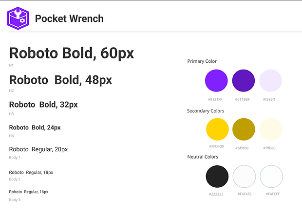
Style Tile
-
Intentional Foundation: The style tile was designed to create a cohesive visual system that reflected Pocket Wrench’s identity as a premium, on-demand service.
-
Typography Choice: Roboto was selected for its balance of professionalism and playfulness, supporting readability and clear navigation.
-
Color Palette: Purple and white tied back to the app’s "PW" abbreviation, with yellow added for warmth and energy.
-
Design Framework: The style tile guided wireframes and prototypes, ensuring consistency, usability, and alignment with the app’s goals.
UI Kit
-
Cohesive System: Created a comprehensive UI kit to maintain consistency and efficiency throughout Pocket Wrench’s design.
-
Versatile Components: Included interactive buttons, collapsible menus, mechanic profiles, progress bars, and options for seamless interaction.
-
Streamlined Updates: Leveraged Figma’s components and instances to ensure quick, consistent updates on all screens.
-
Design Impact: The UI kit served as a foundational tool for creating a polished, flexible, and user-friendly experience.


Before
High-Fidelity Iterations: Key Refinements
-
Original Home Screen (Left): Overwhelming use of purple and low-contrast yellow accents made navigation difficult. Adjustments included scaling back purple, introducing neutral tones, and improving navigation visibility.
-
Service Selection Screen (Right): Cluttered, text-heavy layout with no clear hierarchy. Improved by grouping services into collapsible sections, reordering by user priority, and condensing descriptions into expandable summaries.
-
User Feedback Driven: Iterative testing identified key usability issues, ensuring changes directly addressed user pain points like navigation clarity and cognitive load.
-
Focus on Usability: Refined both screens to guide users through tasks with minimal friction, emphasizing clear hierarchy and logical progression.


After
Final Design
Designing the final version of Pocket Wrench was all about refining the user experience to create a trustworthy, user-centered app. Each step, from initial sketches to high-fidelity prototypes, was shaped by user feedback, turning challenges into actionable improvements.
-
Home Screen: Reduced overuse of purple by adding neutral tones and improved contrast for navigation, creating a more balanced and welcoming interface.
-
Service Selection: Organized services into collapsible sections, prioritized commonly selected options, and simplified text-heavy descriptions for easier navigation.
-
Progress Tracking: Introduced a progress bar and confirmation messages to provide clarity and confidence during multi-step tasks.
-
User Feedback: Iterative testing highlighted pain points and guided key changes to enhance usability and navigation.
-
Visual Hierarchy: Improved the organization of key elements to ensure users could quickly find and interact with the most important features
Conclusion
Designing Pocket Wrench was a transformative experience that refined my approach to problem-solving and user-centered design. Each phase, from research to high-fidelity prototyping, offered valuable insights into creating a product that seamlessly balances user needs and business goals. This lead me to the following key takeaways.
-
User-Centered Approach: Feedback shaped key decisions, like simplifying service selection and adding progress tracking to enhance the user experience.
-
Iterative Design: Testing and refining ensured each iteration brought the app closer to a polished, intuitive solution.
-
Components and Variables: Leveraging Figma's tools improved design consistency and streamlined updates across the project.
-
Process Growth: I gained valuable experience in structuring workflows, prioritizing usability, and crafting thoughtful, scalable solutions.
Pocket Wrench reflects how much my design process has evolved. The lessons learned, like the power of user insights, iteration, and efficient design practices—will guide me as I take on future challenges. This project showcases not just a product, but a journey of growth and learning.
See what I've been up to
%20(1).png)

